“If he was creating monsters, probably no one would be troubled; but because his images are clearly intended to be human, one is compelled to ask why his faces have eyes high up in the forehead, or else scattered in profusion all over the face; why he paints the mouths that stretch like hair combs across the face, and limbs that branch out like thistles. Souza’s imagery is not a surrealist vision- a self-conscious aesthetic shock- so much as a spontaneous re-creation of the world as he has seen it, distilled in the mind by a host of private experiences and associations.” (Edwin Mullins, Souza, London: Anthony Blond Publishers, 1962, p. 39)

Image courtesy of Saffronart

Image courtesy of Saffronart
F N Souza’s striking imagery was the inevitable expression of his scepticism towards society and the hypocrisy of the Church. This is noted in his popularly known ‘Head’ series which is a representation of his critique of the face of our society. Energetically experimental, the series comprises portraits with thick virulent lines and mutated forms. Unlike portraits that are recognisable and give the viewer an understanding of the subject’s character, these heads are a satirical take on the hypocrisy of human society in general. He illustrated them in the manner of his developed visual language of symbolic imagery, bold strokes in a dark palette, as well as distorted forms and figuration. “With these distortions Souza was able to create a forceful denunciation of power and corruption.” (Yashodhara Dalmia, The Making of Modern Indian Art: The Progressives, New Delhi: Oxford University Press, 2001, p. 31)

Image courtesy of Saffronart
The ‘Head’ series has become very popular amongst collectors and admirers alike and is a testament to Souza’s tormented genius that is at once individualistic and appallingly honest. Broken Head, 1957, part of Saffronart’s Evening Sale this year, is a telling example of Souza’s artistic inventions of masterful planar modifications and distorted forms, where deep pain is expressed through lines that jut across the face. These heads are not only a breakthrough in the genre of portraiture, rich with layered connotations but also seminal for their unique formalistic breakthrough. While they display an allusion to Picasso’s portraits on the surface, they remain much farther from them in reality.
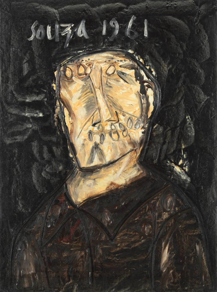
Image courtesy of Saffronart

of Henrietta Moraes, 1963
Image courtesy of Wikipedia
Souza’s heads can be compared to Francis Bacon’s portraits for the similarity in their disfiguration of the face and exploration of the grotesque. Souza and Bacon were contemporaries who displayed their artistic temperaments through similar gestural strokes, dark palettes, malignant subjectivity, and the metamorphosis of expression and anatomy. Another commonality is rightly pointed out by Aziz Kurtha: “It is well known that both Bacon and Souza held the Russian painter Chaim Soutine, who lived in Paris, in high esteem and they both followed Soutine’s exhibition at the Museum of Modern Art in New York in 1950. Even a casual observer could see Souza’s debt to Soutine as well as Rouault, especially in the figures drawn with heavy lines and exaggeratedly distorted human figures.” (Aziz Kurtha, Francis Newton Souza: Bridging Western and Indian Modern Art, Ahmedabad: Mapin Publishing, 2006, p. 42) Another interesting parallel can be drawn in reading the artist’ insights about their portraits where they both assert a need to express inner emotions – Bacon intended to reveal his subject’s personal damage and referred to it as ‘fact’, and Souza, on the other hand, employed the grotesque to symbolise what he called ‘affliction’.

Image courtesy of Wikipedia

Image courtesy of Wikipedia

Image courtesy of Wikipedia
Souza’s art also resonated with the post-war anxiety and disorientation displayed in the works of Expressionist artists such as Edvard Munch. His inclination towards European art movements strengthened upon his move to and subsequent stay in London, from about 1949 to 1967. This period also coincided with Souza’s execution of a number of heads which later became a hallmark of his artistic journey. Francisco Goya was one amongst the other Old Masters who inspired Souza and this admiration surfaced in his series of ‘Black Paintings’ whose formalistic quality is especially similar to Goya’s Pinturas Negras. Like Souza, Goya too bore an anti-clerical outlook, painting images as an exposé of the hypocrisy, bigotry, and cruelty of the Church as seen in his series called Caprichos. The “satirical ferocity of Goya may well have led Souza to revere him even more as an artist and to follow and to sharpen his own anti-clerical inclinations.” (Kurtha, p.40) It is more in Souza’s satirical reflections on society than the style in which Goya’s influences can be felt.

Image courtesy of Saffronart

Image courtesy of Saffronart

Image courtesy of Saffronart
While Souza’s debt to artists such as Titian and Rembrandt is direct as he often quoted them through the imagery and titles, his affinity with the language of Goya and Bacon can be ascertained through the comparisons mentioned earlier. As Souza’s language matured, his heads progressively became more abstract, e.g., Untitled, 1974, “with what looks like reels of material or brain tissue bursting out of it.” (Kurtha, p. 117) They also displayed experimentation with colour to invite pastel pinks and blues that gave his palette a vibrant edge. These portraits usher the viewer into a space of contemplation and introspection. “Their impact is immediate and disconcerting. Here is an obviously gifted artist with considerable abilities as a draughtsman who has developed a very personal manner.” (Terence Mullaly quoted in Kurtha, p. 1910)
Bid on F N Souza’s works at Saffronart’s Evening Sale on 17 September 2022.
Watch Saffronart CEO Dinesh Vazirani as he discusses F N Souza’s ‘Broken Head’ from his iconic series of ‘Heads’ from 1957.


![IMG_7728[1]](https://i0.wp.com/blog.saffronart.com/wp-content/uploads/2016/03/img_77281.jpg?resize=603%2C452&ssl=1)
![IMG_7719[1]](https://i0.wp.com/blog.saffronart.com/wp-content/uploads/2016/03/img_77191.jpg?resize=553%2C738&ssl=1)
![IMG_7759[1]](https://i0.wp.com/blog.saffronart.com/wp-content/uploads/2016/03/img_77591.jpg?resize=1100%2C504&ssl=1)


